
Computational Report Cards
In the course of preparing a literature meeting on post-Hartree–Fock computational methods last year, I found myself wishing that there was a quick and simple way to illustrate the relative error of different approximations on some familiar model reactions, like a "report card" for different levels of theory. I couldn't find any such graphic online, so I decided to make one (click image to view high-res PDF):
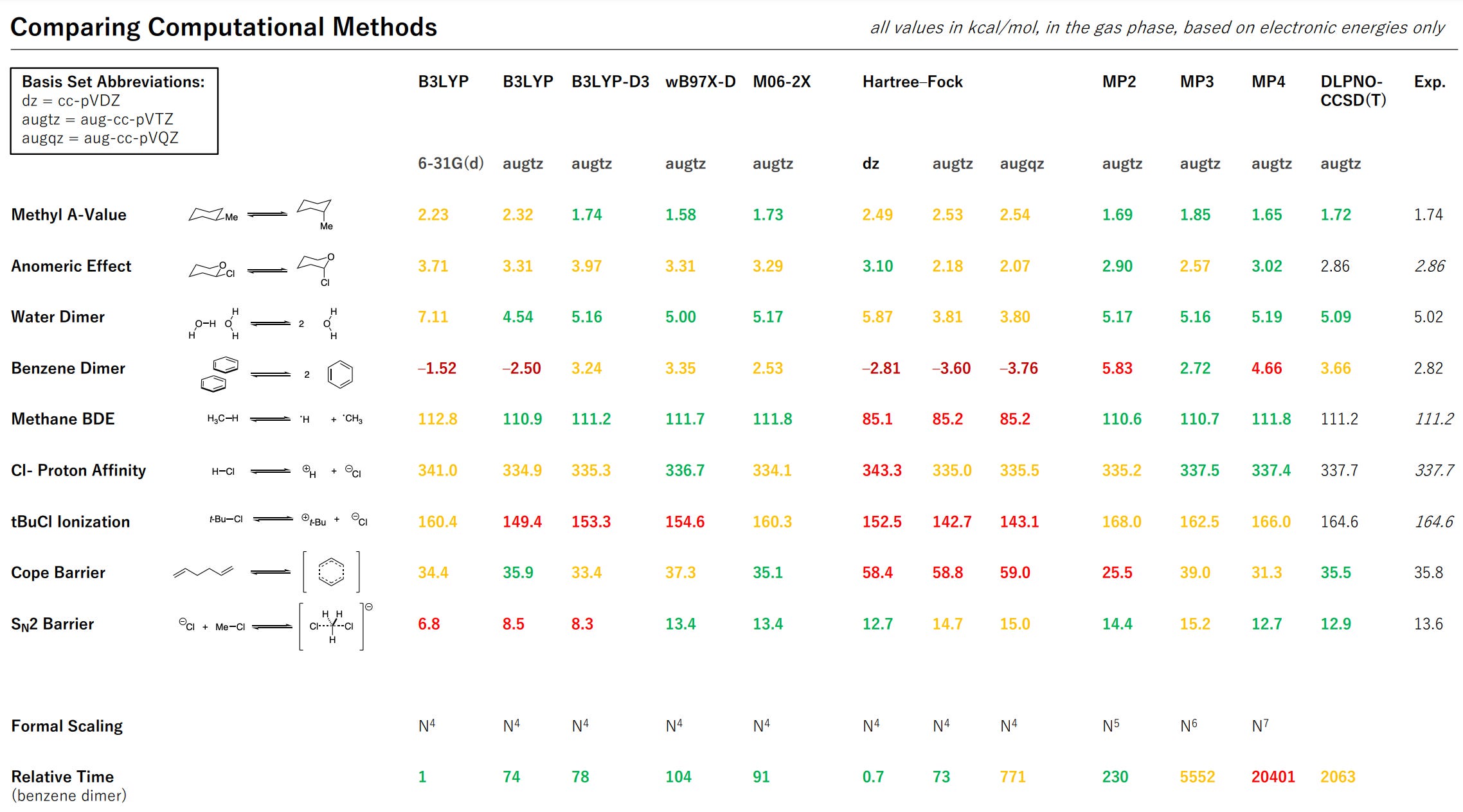
All values are in kcal/mol, and the colors encode the error of the computed value: green values are within 10% or 1 kcal/mol of the truth, while yellow values are within 50% or 5 kcal/mol and red values are outside that range. (In each case the more restrictive cutoff was used.) Where possible, values have been benchmarked to experimental data; in the remaining cases, coupled-cluster calculations were employed.
While small relative to more professional benchmarks, these data nicely illustrate a few important trends:
Dispersion corrections are badly needed for density-functional theory, but beyond that there isn't a clear "best" DFT method.
Hartree–Fock theory consistently predicts electron-dense species to be less stable than they are, owing to the neglect of electron correlation: so anions are too basic/nucleophilic, bonds are too weak, and the aromatic Cope transition state is far too high in energy.
Second-order Møller–Plesset perturbation theory (MP2) overcorrects the Hartree–Fock error, MP3 overcorrects the MP2 error, and MP4 overcorrects the MP3 error. The result is that HF and MP3 tend to "zig" where MP2 and MP4 tend to "zag." (The crude solution of just averaging MP2 and MP3 is surprisingly effective.)
DLPNO-CCSD(T), from Neese and co-workers, really is a magical combination of speed and accuracy!
Hopefully this overview, while simple, helps to build intuition about how good or bad computational predictions at a given level of theory are.